Web Accessibility
Accessible design principles promote a better user experience for everyone, making our content more user-friendly, easy to navigate, and understandable. In addition, the university has a legal obligation to make sure people can access all the content we produce. This includes people with visual, hearing, cognitive, or motor impairments, and those with learning difficulties.
People with visual disabilities often use a tool called a screen reader that reads text from websites out loud.
U.C. Berkeley’s Web Accessibility team published a page that explains “What is a screen reader anyway?” and produced a video that shows how one is used.
All images must have alternative text (i.e. alt text). People with vision disabilities use screen readers to listen to the content on web pages. Screen readers will read out the alt text of the image so the user can understand the visual content of the page.
Imagine you’re reading out the content of the page over the phone. What would you say about the image to explain it to the listener?
Avoid images with text on them. Screen readers cannot pick up text from an image, and when images are sized down for phone screens, the text also becomes illegible for sighted users.
Primary image?
Also consider whether the image is primary, meaning seeing it is the only way to deliver specific content (e.g. event poster). If so, then try to also reproduce that same content below the image in addition to a description the explains to “look below” for more details.
Otherwise, if the image is secondary, provide enough of a description (i.e. word, phrase, sentence) to describe the image.
Videos must have closed captions. Whether you link to or embed a video, it must contain closed captions. We recommend using YouTube to host and embed your videos on the csumb.edu site.
You can upload a transcript of your video to YouTube and it will caption automatically.
FYI: We do not recommend relying upon the “automatic captioning” that comes with YouTube, especially for video recorded outside of a studio. Sound recorded in strong wind or without proper microphones makes it difficult to pick up words or sentences.
Example of poor automatic captioning
The text of the link should reflect the purpose or destination of the link.
Do not use generic phrases like “read more” or “click here” as linked text.
Learn more about writing good links.
Example
Before
Other locations offering influenza vaccines can be found here
After
Find other locations offering influenza vaccines.
Screen reader
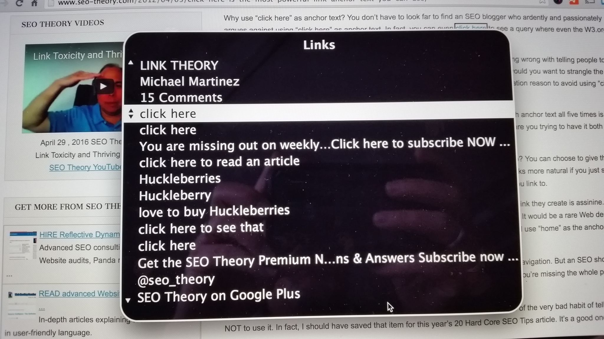
Below is an example of what it might sound like to hear “click here” repeatedly from a screen reader. In this example, using VoiceOver in Mac OS X, it’s possible to just view/hear the links on the page without the paragraph text that might provide further context.

Imagine hearing “click here” over and over but not knowing which link is which.
We are legally required to ensure that all content on the campus website is accessible to people with disabilities. In addition, we strive to make sure that all information on the site is readily available to people regardless of their devices.
PDFs, Microsoft Word documents, and other document files lock information into a format that is oftentimes not accessible to people with disabilities. It also offers an unpleasant experience for the 40-60% of our users who are browsing the website on their phones. Therefore, Web Services strongly encourages creating web pages as an alternative to uploading documents to the campus website.
What you should not upload
A scanned document that is just a series of images.
An organization chart.
An event flier.
A document that could easily be made into a webpage.
A document that reproduces information already on the website.What you can upload, if they are fully accessible
Documents that the campus is legally required to post.
Forms which must be printed, and cannot be reproduced in a online format, such as Google Drive, or the campus document management system. Work with web services to ensure that these are accessible.Users with disabilities often navigate web pages by skipping from heading to heading. When you use heading blocks correctly, they are tagged in a way that makes this possible. However, sometimes users will make regular text all caps and bold to mimic a heading. Because this text is not tagged the same way in the backend, these faux headings are not useful to people using assistive technology.
Always use the heading blocks to create headings.
Digital Accessibility
The Center for Academic Technology provides more information about the importance of accessibility on their website under Digital Accessibility.
Tools
WebAIM's Color Contrast Checker