


Content Type Guidelines
Build clear, consistent pages using the following types of content:
- Page Header
- Side Navigation
- Full Width Content
- Promotional Call out
- Listing
- Accordion
- Profile Listing
- Contact Section
Components of a page
All pages must include a Page Header and Side Navigation.
Page Header
Content Type Name: CSUMB 2024 - General Content - Full Width
The Hero Header should be the first content type on every page you create. It serves as the page title and gives the page its first-level header (H1), which is required for accessibility compliance.

Side Navigation
Content Type Name: CSUMB 2024 - General Content with Navigation
The General Content with Navigation content type should be the second content type on every page you create. This content type is needed to display side navigation, which shows the current page’s position within the page hierarchy and provides links to related pages.
General content is required and appears to the right of the side navigation.
Typically, there is only one of this content type on a page; however, if two are used, they should immediately follow each other to prevent a duplicate side navigation from displaying. If two of these content types are used and they do not immediately follow each other, the result will be two identical side navigation menus.

Full Width Content
Content Type Name: CSUMB 2024 - General Content - Full Width
The General Content Full Width content type should used to add paragraphs to a page that extend the full horizontal width of the page. This content type can also be used to add:
Bulleted lists
Lists can be:
- Numbered
- Indented
- Alphabetical
- Roman numerals
Tables
Tables should be used sparingly due to their higher risk for accessibility compliance. Tables should be used to display data and must have column headings.
| Column 1 Heading | Column 2 Heading | Column 3 Heading |
|---|---|---|
| 50% | 100% | 80% |
Blockquotes
Blockquotes should include a quote attribute and quotation marks around the quote. They should be short and length to increase readability.
"At Monterey Bay] I feel seen and acknowledged. I have a relationship with every one of my professors. I feel like they all have my back and want to see me do well. It's a lot easier to learn this way. "
- Jordan Janusz ’24
Buttons
Buttons should be short in length and descriptive of their destination.
Promotional Call Out
Content Type Name: CSUMB 2024 - Promo Component
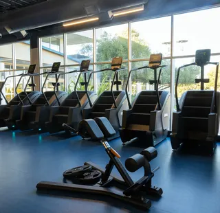
The Promo content type should be used to highlight an upcoming event or new service. A promo should link to a page with more information about the item being highlighted. Images are optional but help draw attention to the content.
Promo Title
Promo description including details, location and time.
Listing
The Listing content type should be used when you have a group of 2-6 related pages that need to be linked to. Images are optional for this content type.
Section Title
Accordion
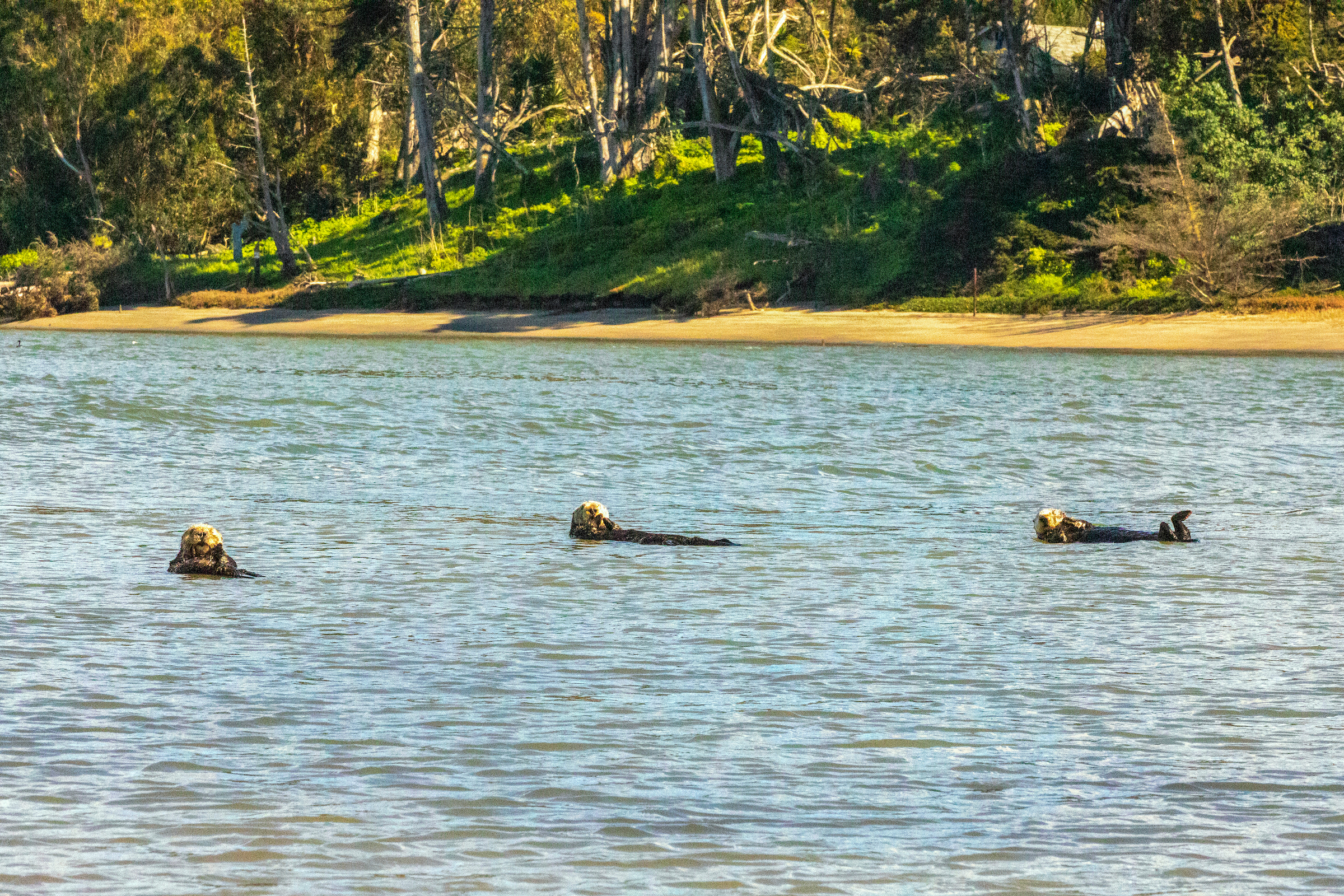
The Accordion content type should be for content that with a narrower audience. Accordions are not good options for content that is something that most visitors to the page will want to see. Content within an accordion should not be short; if it is shorter than 100 words, the better experience would be . Images are optional for this content type.
Accordion content goes here and can include bulleted lists, buttons, images and links.
Profile Listing
Content Type Name: CSUMB 2024 - Profile Section
The Profile Listing content type displays the name and title of a current employee. It should be primarily used on Faculty and Staff pages. To place an employee's profile on a page, you'll need to know their section number.
Find an Employee Section Number

Francine Lontoc
Senior Digital Content and Experience Lead

Jacob Bello
Digital Content Specialist
Contact Section
Content Type Name: CSUMB 2024 - Contact Section
When used, the Contact content type should always be the last content type on a page. The second and third cards should be used to display address, phone number, and email information for an individual or department. The first card should be used to list business hours or request action through a button linked to a form or other page.

Card 1 Title
This is where you can list business hours or information about whatever the button links to.
Card 2 Title
A description for this card is required.
Card 3 Title
This card is optional and also has the option for email, phone number, and address.