


Content Types and Guidelines
Components of a page
These guidelines cover the following content types, which are available to all editors on non-core pages:
- Page Header
- Side Navigation
- Full Width Content
- Promotional Callout
- Listing
- Accordion
- Profile Listing
- Contact Section
All pages must include a Page Header and Side Navigation.
Edits to other content types and Core pages can be made by submitting a ticket to Web Services.
Page Header
Content Type Name: CSUMB 2024 - General Content - Full Width
Placement: First content type on a page
Purpose: Provides a page title as a first-level header (H1), which is required for an accessible page structure.

Side Navigation
Content Type Name: CSUMB 2024 - General Content with Navigation
Placement: Second content type on the page
Purpose: Displays side navigation, which shows the current page’s position within the page hierarchy and provides links to related pages.
Note: General content (text) must be included in this content type and appears at the top of the page following the page header.
Tip: If more than one of this content type is used on a page, they must immediately follow each other to prevent a duplicate side navigation from displaying. It is recommended to use one of these content types per page.

Full Width Content
Content Type Name: CSUMB 2024 - General Content - Full Width
Placement: Can be placed as the third content type on the page or anywhere after it.
Purpose: Provides text, including bulleted lists, tables, blockquotes, and buttons, that extends the full horizontal width of the page.
Bulleted lists
Best Practice: Use bullets for related, equally important items and keep list items under 7 to increase readability. Provide context by including a leading sentence before the list.
Lists can be:
- Numbered
- Indented
- Alphabetical
- Roman numerals
Tables
Best Practice: Use to display data and always include meaningful column headings.
Tip: Keep columns under 3 to prevent the end user from having to scroll left and right to view the entire table. Consider the mobile experience when creating tables.
Note: Use tables sparingly and only for tabular data, as complex or improperly structured tables can create accessibility barriers.
| Column 1 Heading | Column 2 Heading | Column 3 Heading |
|---|---|---|
| 50% | 100% | 80% |
Blockquotes
Best Practice: Keep quotes under 50 words to increase readability.
Tip: Be sure to include quotation marks and an attribution.
"At Monterey Bay] I feel seen and acknowledged. I have a relationship with every one of my professors. I feel like they all have my back and want to see me do well. It's a lot easier to learn this way. "
- Jordan Janusz ’24
Buttons
Best Practice: Use concise, action-oriented language that describes what the user can expect to see when selecting the button using 6 words or less.
Important: Never include the words "click here," and when using "learn more," include what the user can learn more about. If this results in more than 6 words, remove "learn more" or replace it with a single action-oriented word such as "explore"
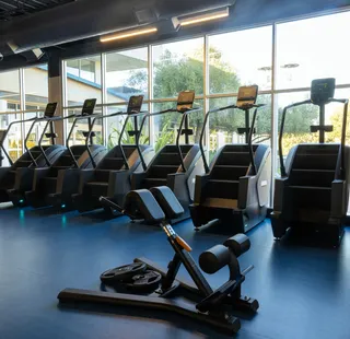
Promotional Call Out
Content Type Name: CSUMB 2024 - Promo Component
Purpose: Highlights an upcoming event or new service.
Best Practice: Keep the title concise and at or under 6 words to improve readability. Link to a page with more information if it exists, rather than attempting to fit all the details in the Promo content type.
Note: Images are optional but help draw attention to the content.
Promo Title
Promo description including details, location and time.
Listing
Content Type Name: CSUMB 2024-Listing Section
Purpose: Provides navigation to a group of 2-6 related pages. Images are optional for this content type.
Best Practice: Add a section title to a group of listings to help users find information faster. Keep listing groups at 6 or fewer to maintain visual interest and readability.
Section Title
Accordion
Content Type Name: CSUMB 2024-Accordion
Purpose: Reduces visual clutter by organizing related information into manageable sections. Allows users to scan headings and open only the content they need.
Best Practice: Use accordions for secondary information exceeding 100 words, using concise, descriptive headings while keeping essential content and calls to action visible.
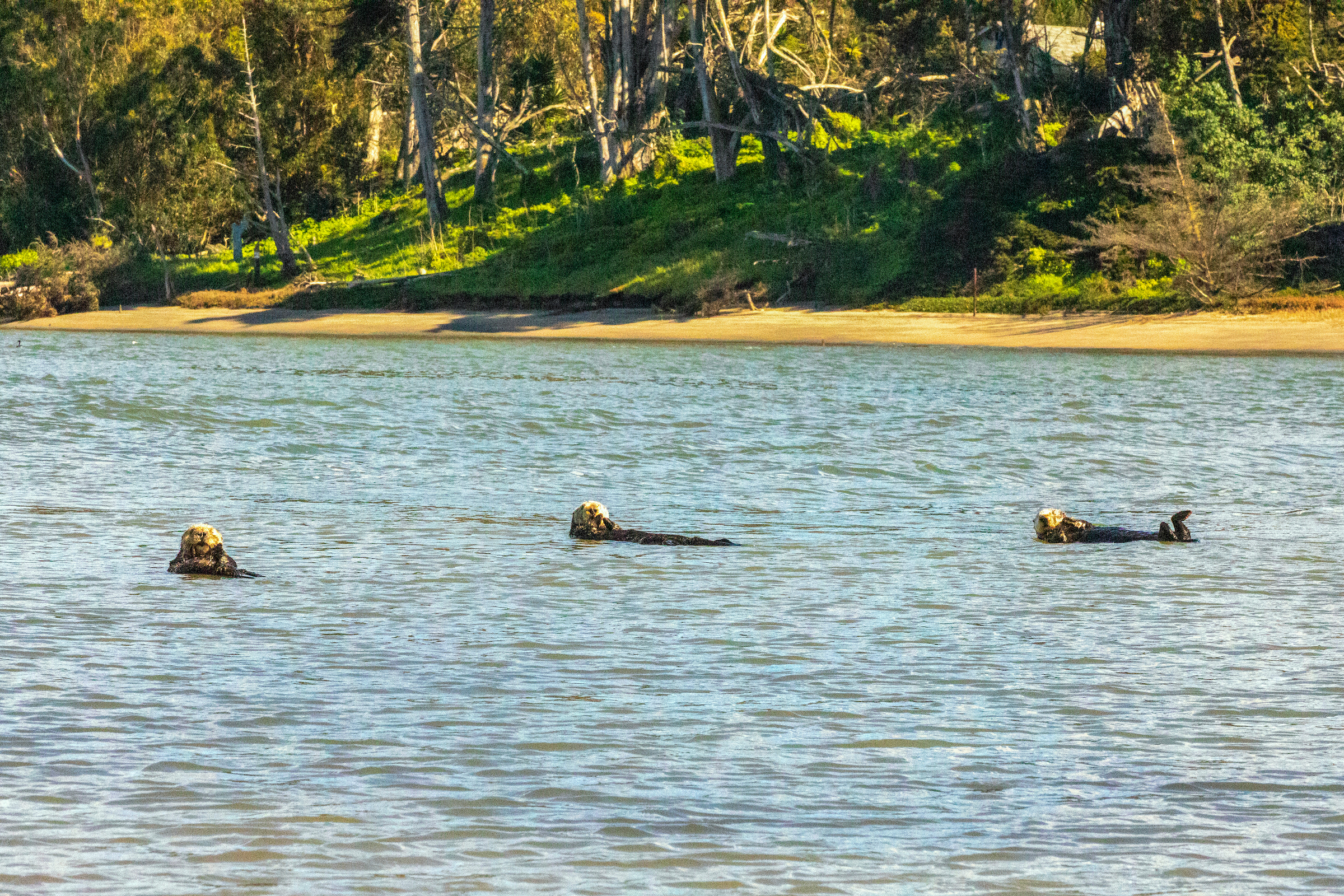
Accordion content goes here and can include bulleted lists, buttons, images and links.
Profile Listing
Content Type Name: CSUMB 2024 - Profile Section
Purpose: Displays the name, title, and directory photo of a current employee.
Placement: Faculty and Staff pages.
Tip: To place an employee's profile on a page, you'll need to know their section number.
Find an Employee Section Number

Francine Lontoc
Senior Digital Content and Experience Lead

Jacob Bello
Digital Content Specialist
Contact Section
Content Type Name: CSUMB 2024 - Contact Section
Purpose: Provides the address, phone number, and email information for an individual or department.
Placement: Last content type on the page.
Best Practice: Use the first card to list business hours or request action through a button linked to a form or other page. Use the second and third cards to list the address, phone number, and email of an individual or department.

Card 1 Title
This is where you can list business hours or information about whatever the button links to.
Card 2 Title
A description for this card is required.
Card 3 Title
This card is optional and also has the option for email, phone number, and address.